|
10.23 Service Velocity Dashboard
KB 3231, Release Note, Dashboard Service, 9/10/2025
We're excited to unveil a powerful new enterprise tool in Version 10.23: the Service Velocity Dashboard - designed to give your Service Department a sharper, smarter edge.
This multi-dimensional Dashboard enables Dealerships to monitor and analyze critical performance metrics, compare results across locations, spot emerging trends, and align strategies for improved consistency and profitability.
With high-level visibility and real-time insights into daily activity, month-to-date performance, and open work orders, you'll have a clear view of what's happening and where to focus next.
Featuring key metrics, customizable views, and detailed insights, this tool empowers your team to make faster, data-driven decisions with confidence.
Scroll down to explore everything this new tool has to offer!
Dashboard Setup
To get started, simply add the
Service Velocity page
to an existing Dashboard - such as your Service Management Dashboard.
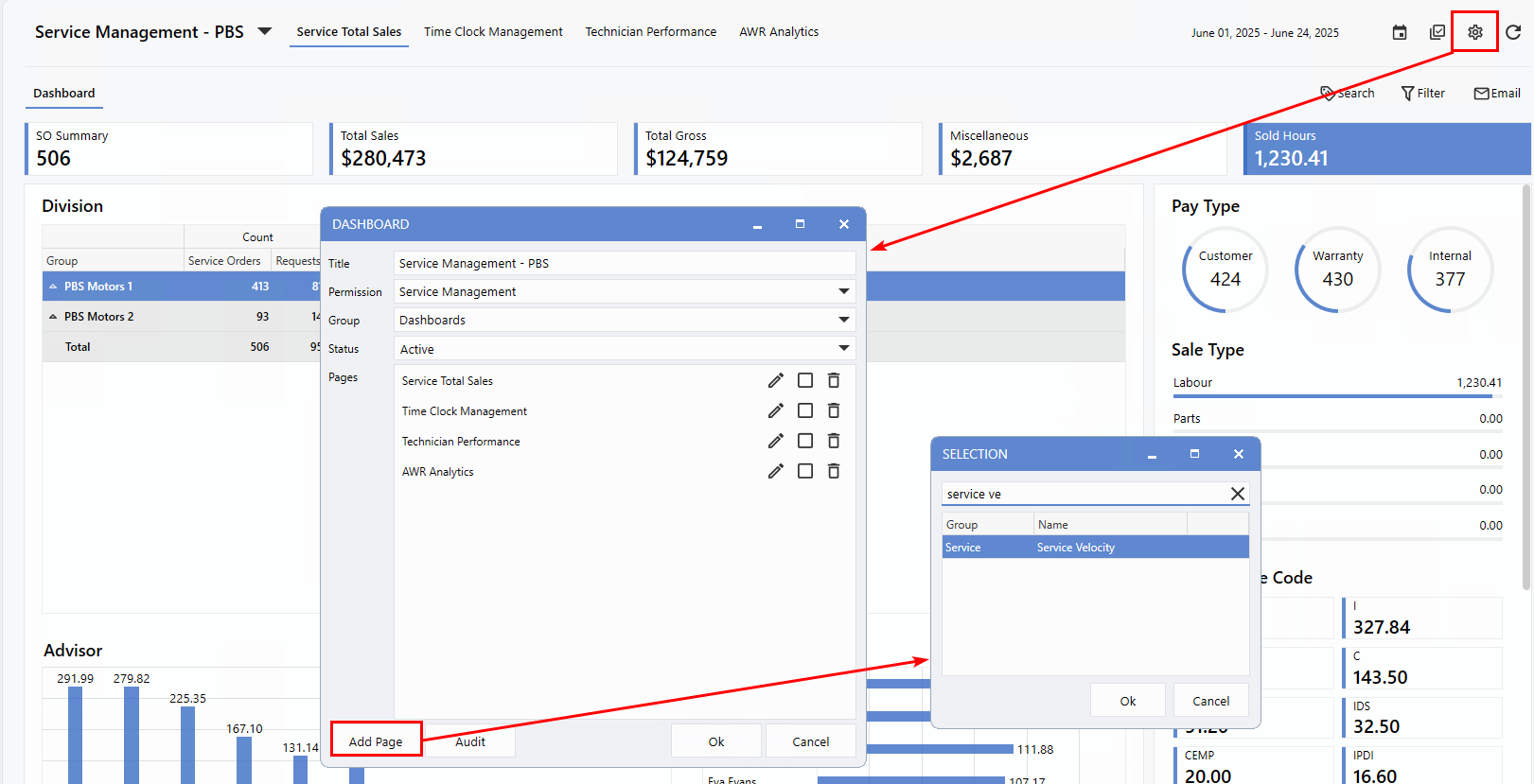
How to Add the Service Velocity page
1.
Click the
gear icon
from the top right corner
2.
Click
Add Page
to locate the
Service Velocity
page
3.
Click
Ok
to add the page
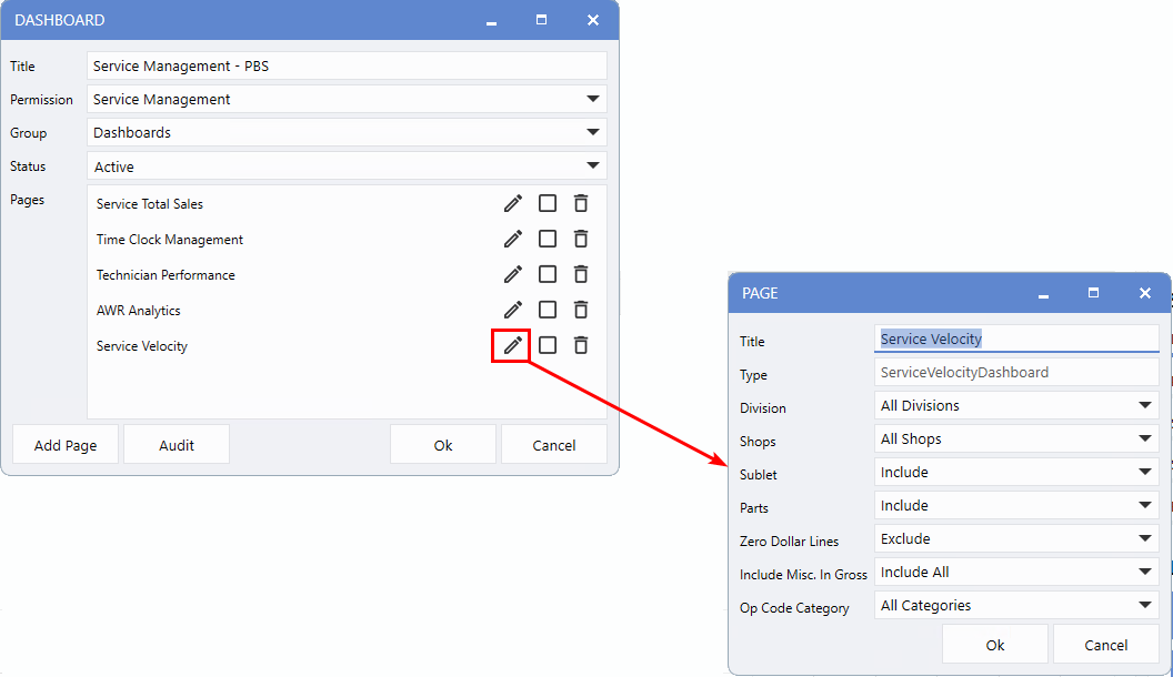
Criteria Page Configurations
Setting up the Service Velocity page is quick and familiar - it follows a similar process to configuring the
Service Total Sales
page. Just click the
pencil icon
to edit the page and customize the settings to suit your needs.
-
Division:
For Dealerships using divisional setups, this option offers flexible data views. You can select
All Divisions
(default), specific combinations, or a single division using a drop-down list.
-
Shops:
Choose the exact shops you want to include. For divisional setups, each shop is displayed with its division name, code, and description for easy identification.
-
Sublets, Parts, and Zero Dollar Values:
Toggle these options on or off to refine the data shown based on your reporting preferences.
-
Include Misc. in Gross:
This is set to Include
All
by default, but you can deselect items to tailor your gross profit calculations.
-
Op Code Categories:
Further customize your data view by selecting specific Op Code categories - ideal for highlighting particular job types or tracking targeted performance areas.
Overview
The summary view puts key dollar-based Metrics front and center, giving you a quick snapshot of monthly performance. Below that, the
grid
provides a high-level overview of essential data points, while the
Insights
section at the bottom uses visualizations to help uncover trends and patterns. To the right, data is organized by
Type
, making it easy to locate and compare related figures at a glance.
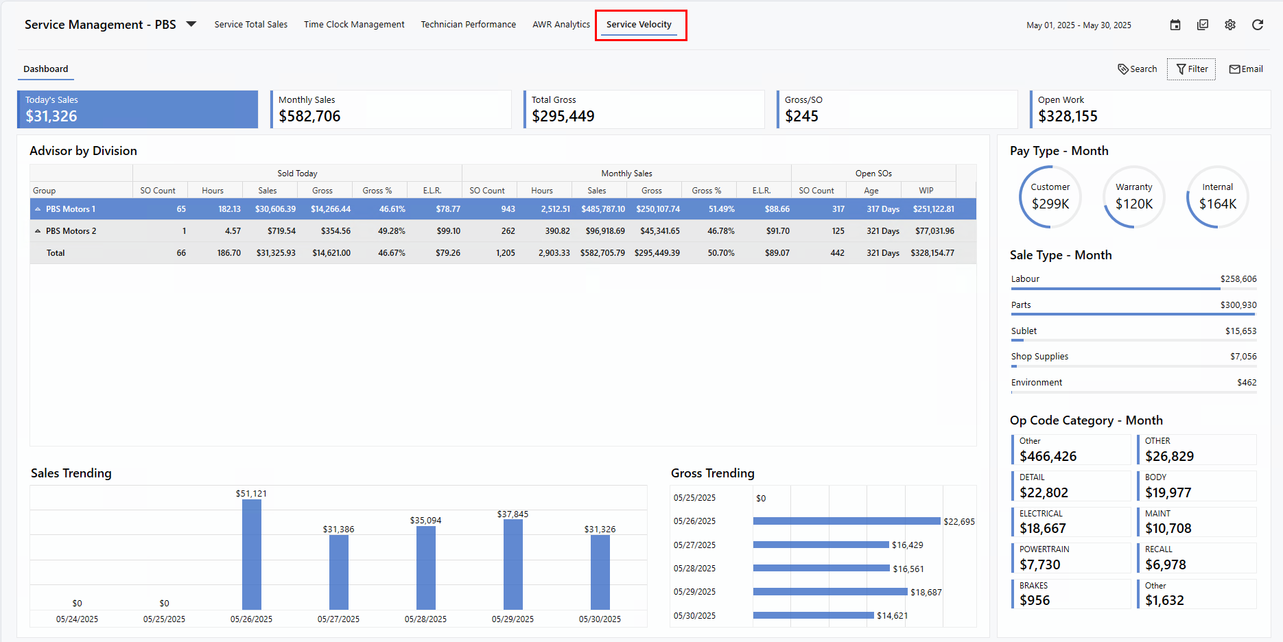
Let's take a closer look at each section.
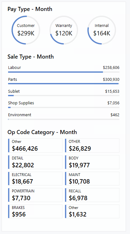
Metrics
The Dashboard displays key financial metrics starting with
Today's Sales
, based on the date shown at the top of the screen. This is followed by
Monthly Sales, Total Gross, Gross per Service Order
, and finally, the value of
Open Work
.
The first four metrics are calculated from
cashiered
Service Orders, while
Open Work
represents the total value of jobs still in progress. This provides a high-level view of current workload but is
not
intended for payroll calculations.
To make navigation even easier, helpful tooltips are available - just hover over each button to see a brief description.
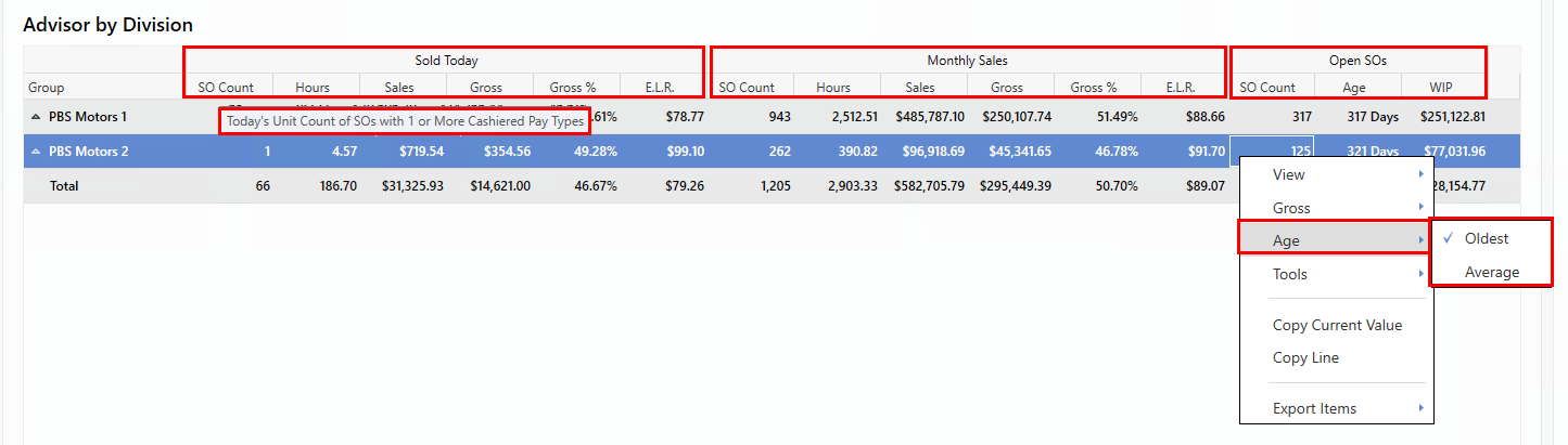
Column Groupings
The
Sold Today
section displays all Service Orders cashiered today, including sub-columns for the number of Service Orders, associated Hours, Sales, Gross, Gross %, and Effective Labour Rate.
The
Monthly Sales
section provides month-to-date figures with detailed breakdowns, while the
Open SOs
section highlights the current number of open Service Orders, their age, and total Work in Progress (WIP) sales to date.
You can further tailor the data by right-clicking on specific columns.
-
For
Age
, choose to display either the
oldest
or
average
open SO age.
-
For
Gross
, switch between viewing totals or values
per unit
. Data will update instantly based on your selection.
To support your understanding, we've included helpful tooltips for each column, featuring definitions and calculation details.
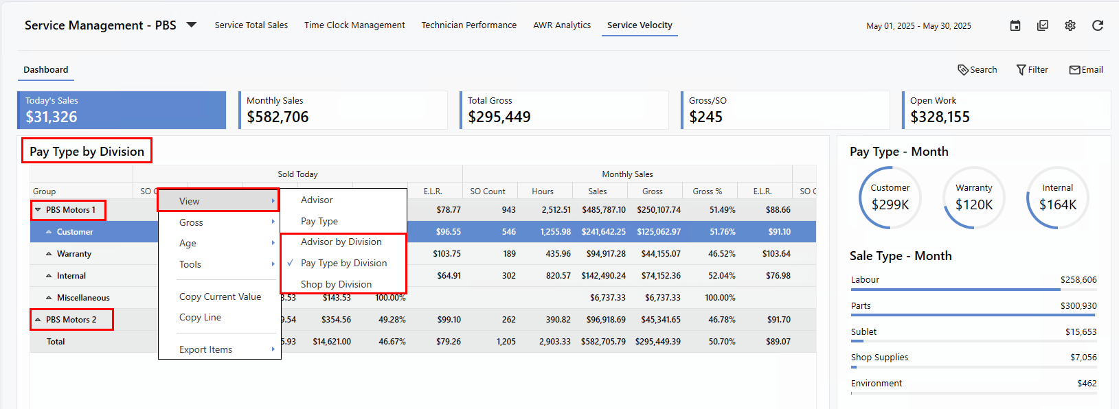
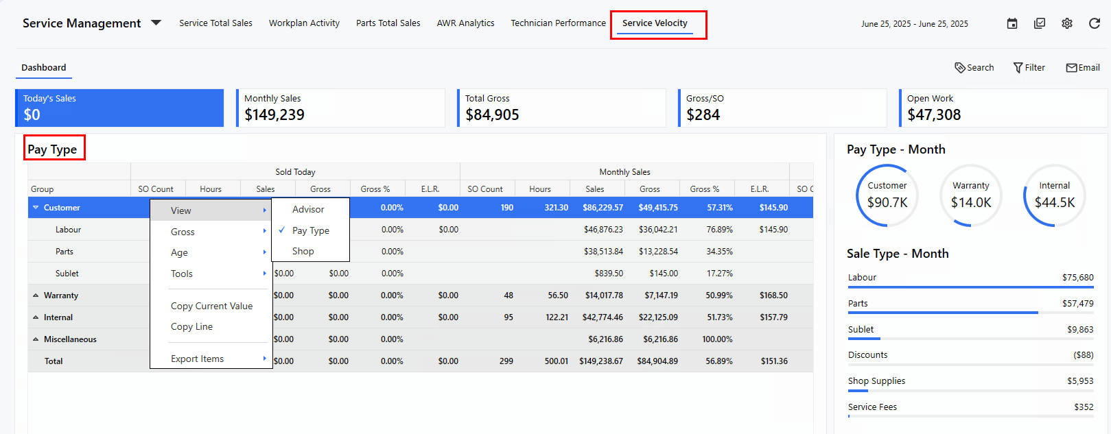
Views
The Dashboard offers multiple ways to analyze your data, including views by
Advisor, Pay Type
, and
Shop
. For divisional Dealerships, three additional views are available:
Advisor by Division
,
Pay Type by Division
, and
Shop by Division
.
To change views, simply
right-click
, select
View
, and choose your preferred option. The right-click menu also provides the ability to expand or collapse data groups and includes various export options for easier sharing and reporting.
Example: Divisional Dashboard
In divisional setups, the grid includes an additional layer in the menu tree, showing the
Division name
first. From there, you can drill down into each store for detailed month-over-month comparisons.
Example: Non-Divisional or Single Store
For non-divisional stores or single-store dashboards, the menu tree reflects the selected view (e.g., Advisor, Shop), and still allows drill-down access to more detailed performance data.
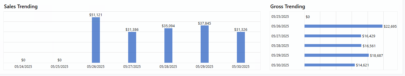
Insights
Along the bottom of the Dashboard, you'll find two trend-focused charts:
Sales Trending
and
Gross Trending
. These visuals display data for the current week, ending with today's date.
Groups
The right-hand panel displays grouped statistics for cashiered Service Orders, providing a monthly breakdown by
Pay Type
,
Sales Type
, and
Op Code Category
.
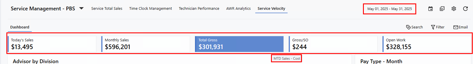
Detailed View
Clicking any Metric buttons or data point in the
summary grid
opens a detailed view, revealing additional columns for deeper analysis. The Dashboard also highlights the drill-down path, allowing Users to easily navigate back with a single click.
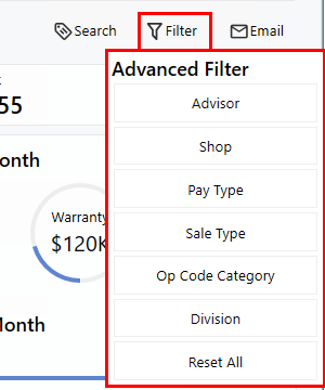
Advanced Filter
Users can quickly refine data with a variety of options in the
Advanced Filter
, accessible from both the summary and detailed Dashboard views for enhanced granularity.
|